BlueCross BlueShield LA Internship
(Design system: components and designs)


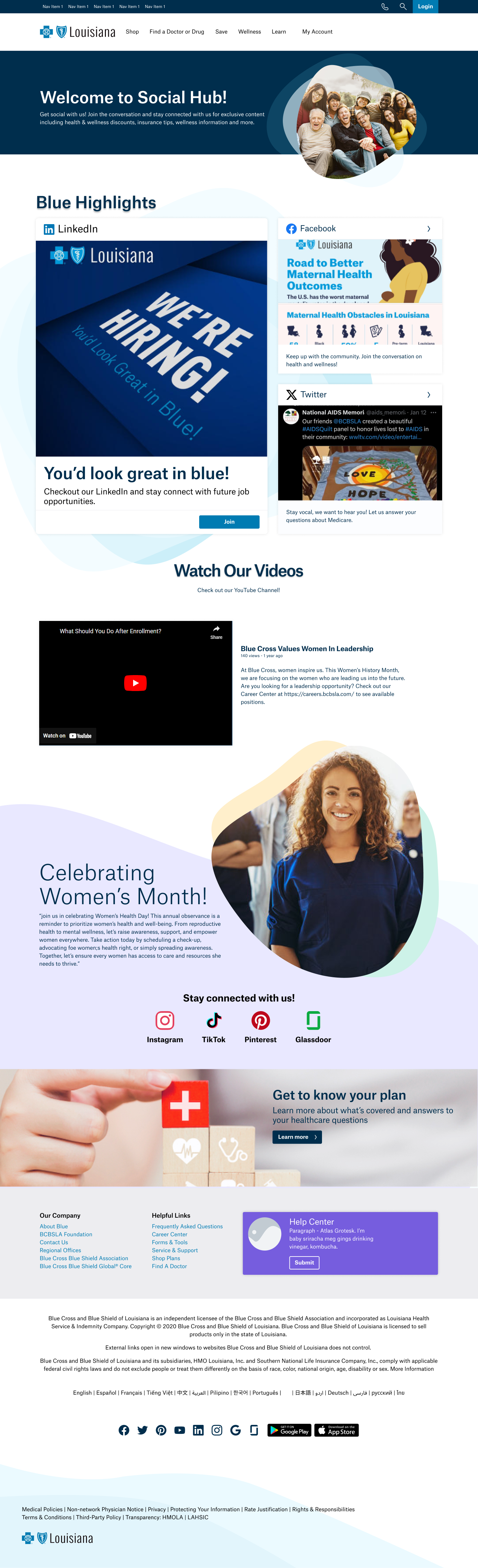
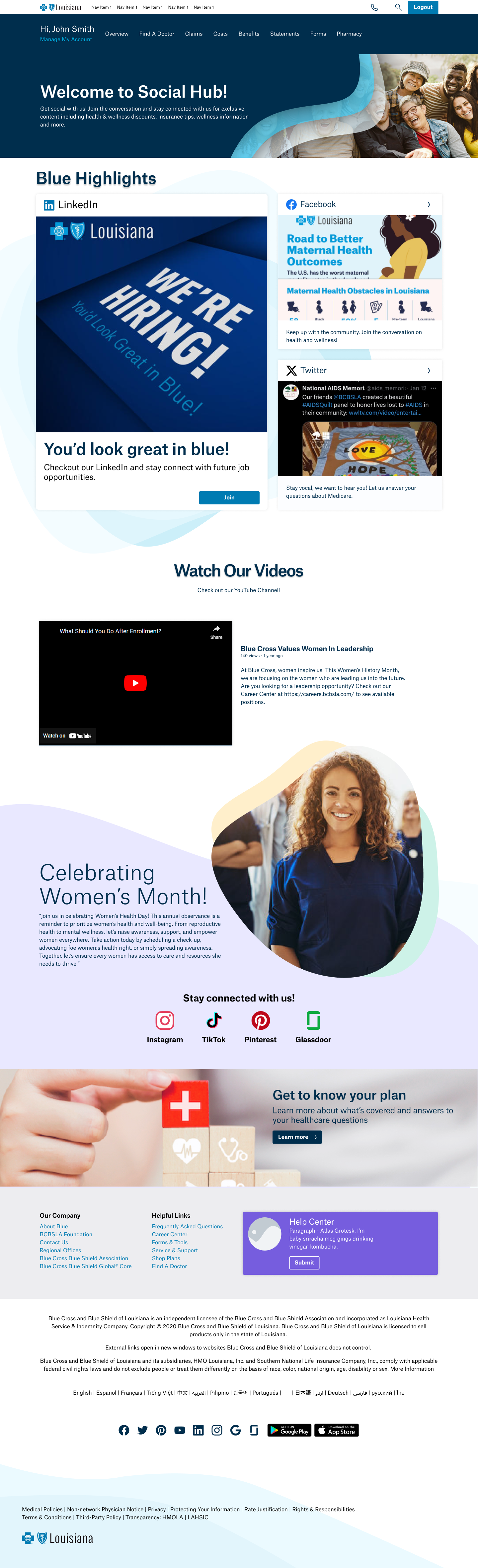
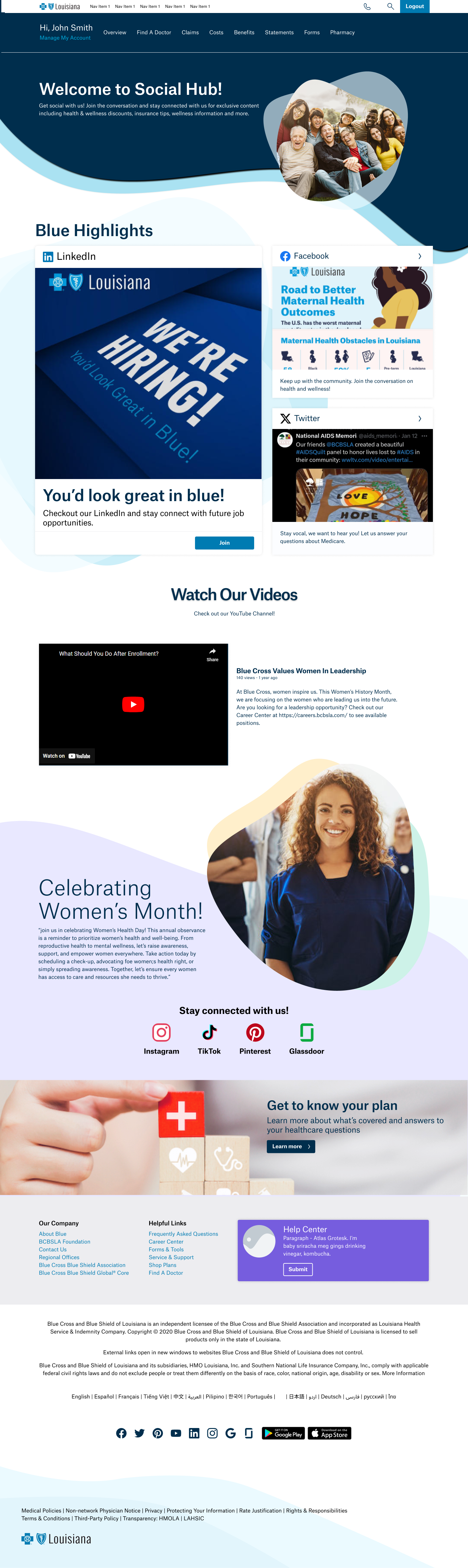
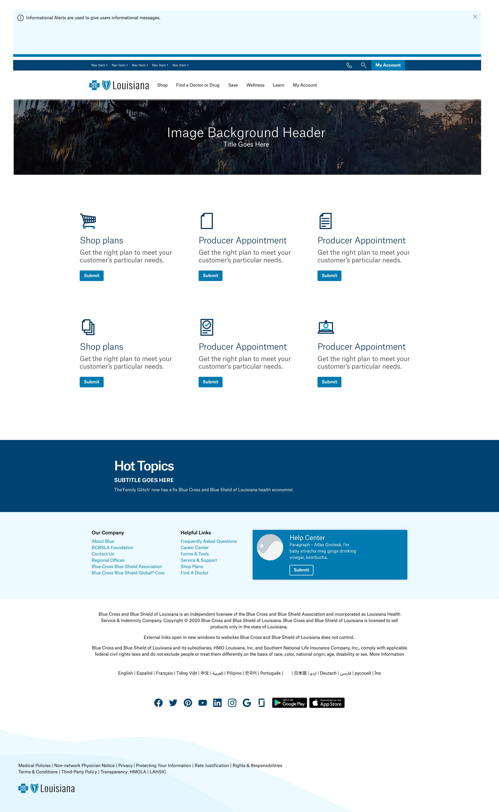
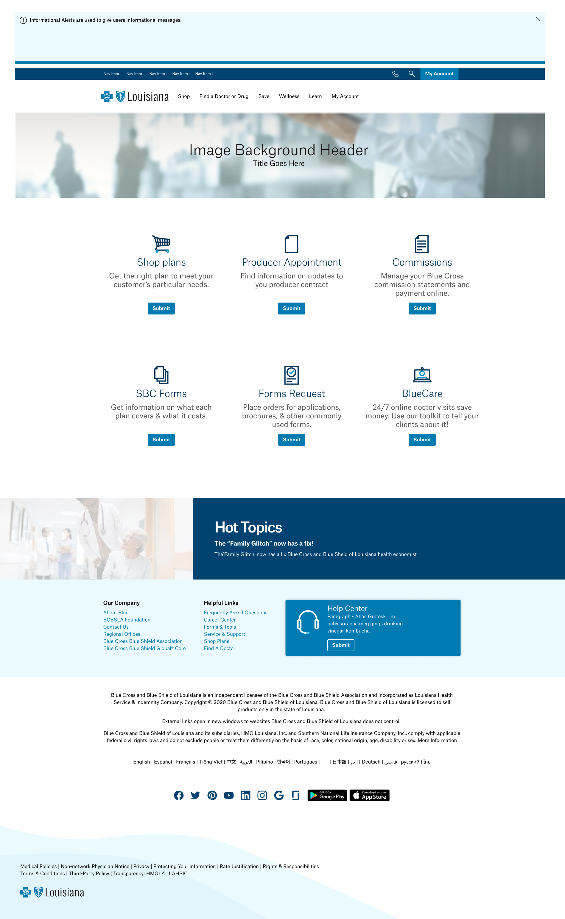
BCBSLA Social Hub


Content Guide

BCBSLA Icons


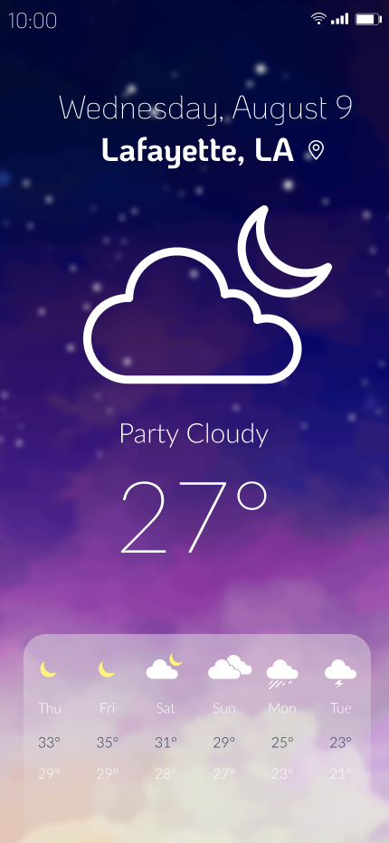
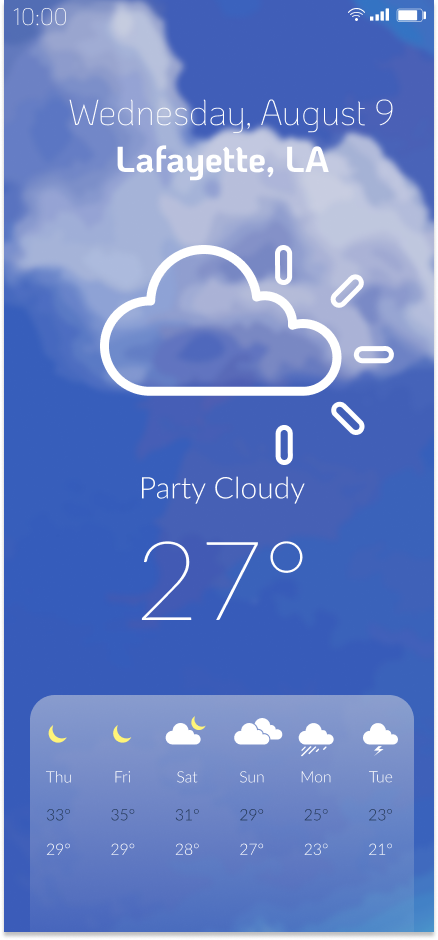
Mobile App Prototype/Mockup (WiP)

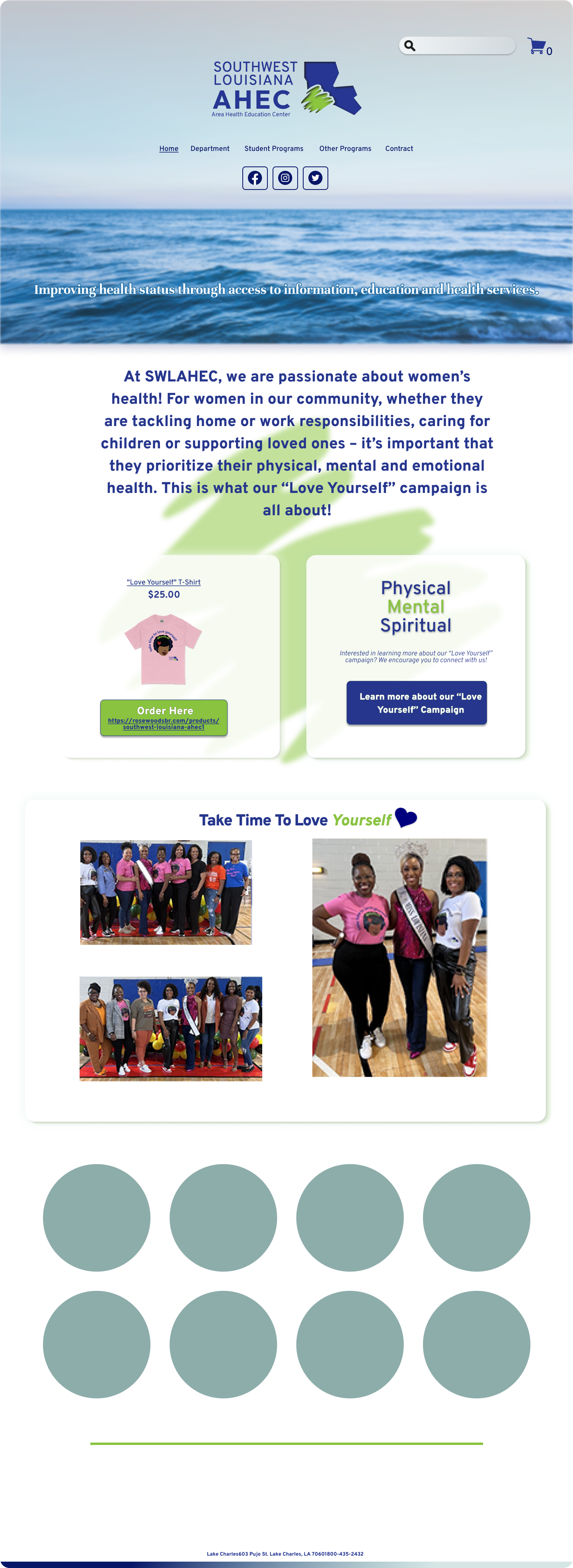
SWLAHEC
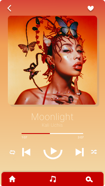
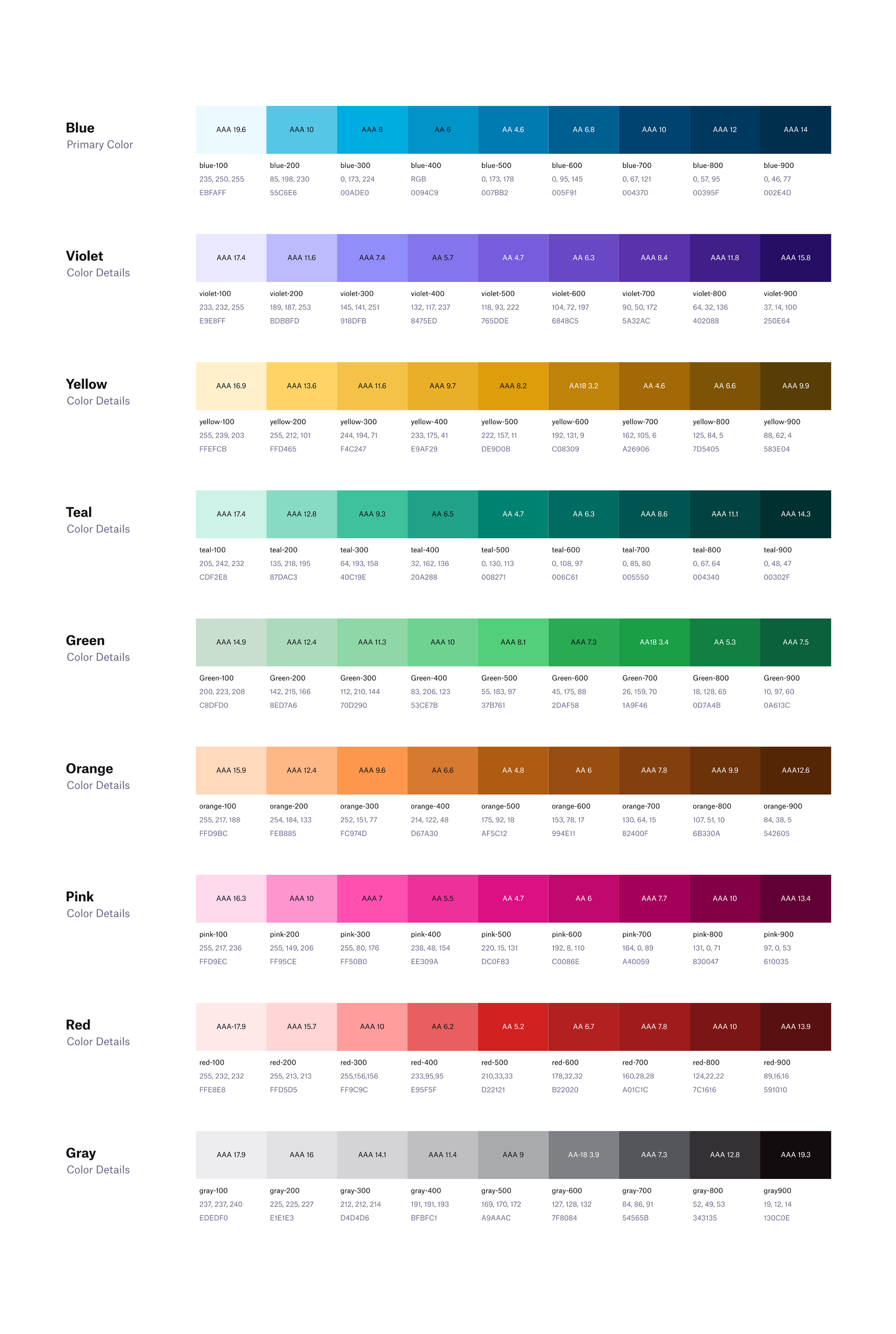
Consistency in design elements helps reinforce an artist's brand identity. When users see the media player with colors that match the album cover, it creates a recognizable and memorable association with that artist. This can be particularly effective for establishing a cohesive visual presence across different platforms or applications. Also Colors can evoke emotions and set a particular mood. By incorporating the colors from the album cover, you can create a more immersive and emotionally resonant experience for the user. This can help deepen their connection with the artist's music and enhance the overall enjoyment of using the media player.
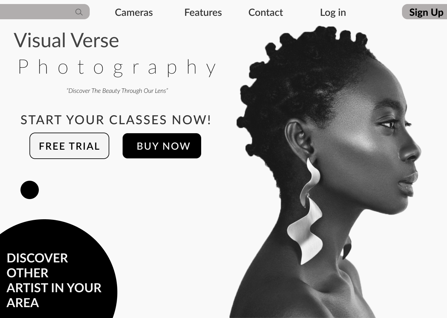
A clean design often incorporates clear visual hierarchy and intuitive navigation. This makes it easier for visitors to browse through the photography page and find the information they need. By organizing the cover model profile and related content in a structured manner, you enhance the user experience and ensure that visitors can easily access relevant information or explore more work.
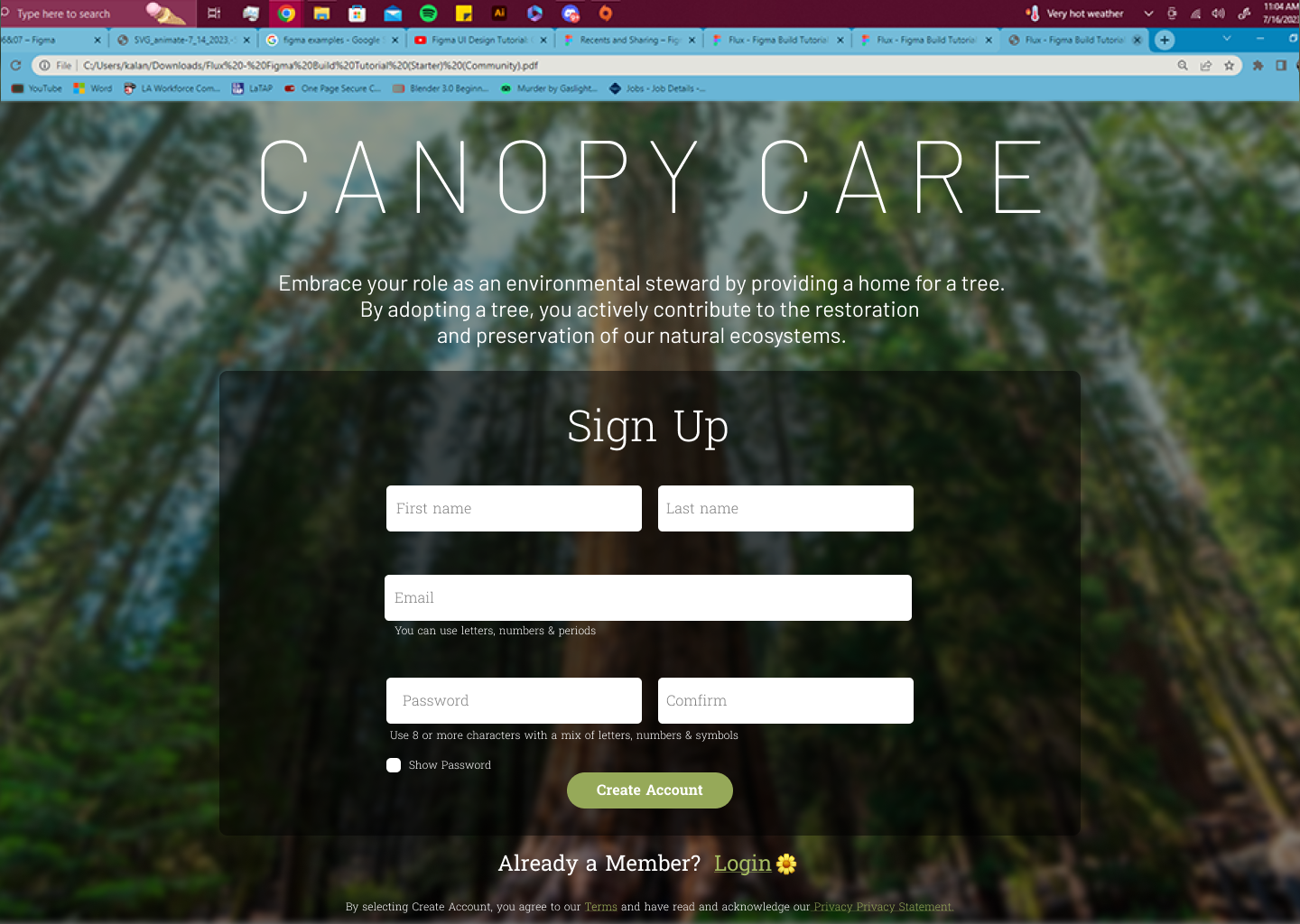
Placing the sign-up page in a visually appealing and meaningful environment increases user engagement. The forest background captures attention and creates a positive association with the cause, making visitors more likely to explore the sign-up page and take the desired action. It enhances the user experience by immersing users in an environment that aligns with their interests and motivations.
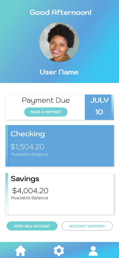
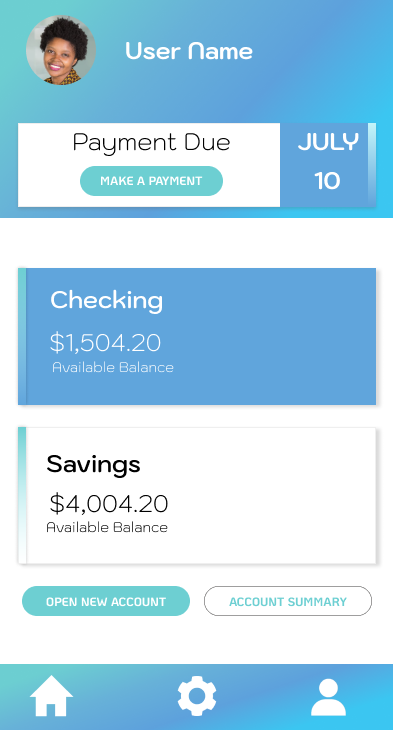
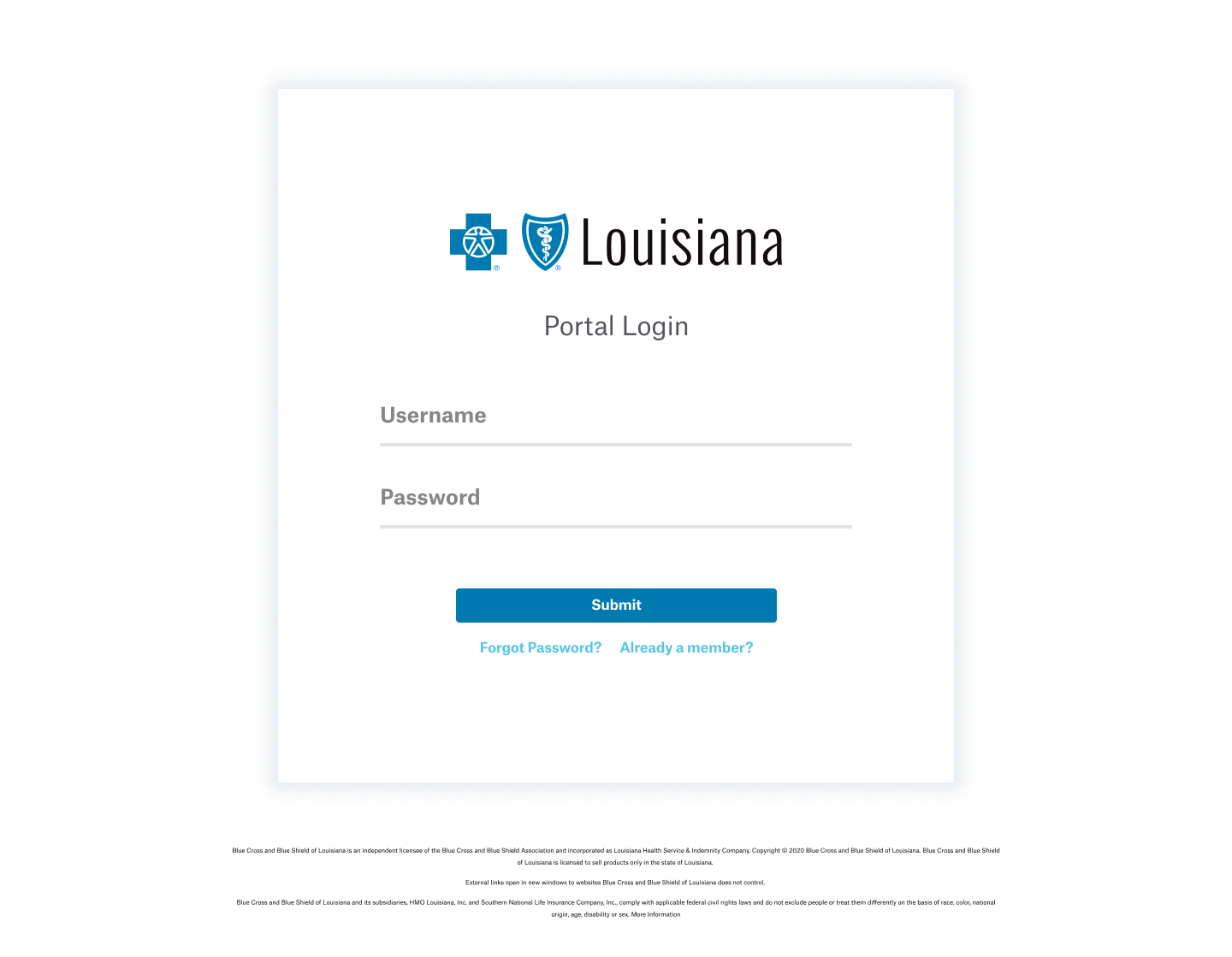
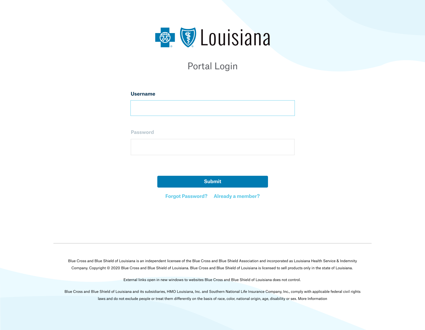
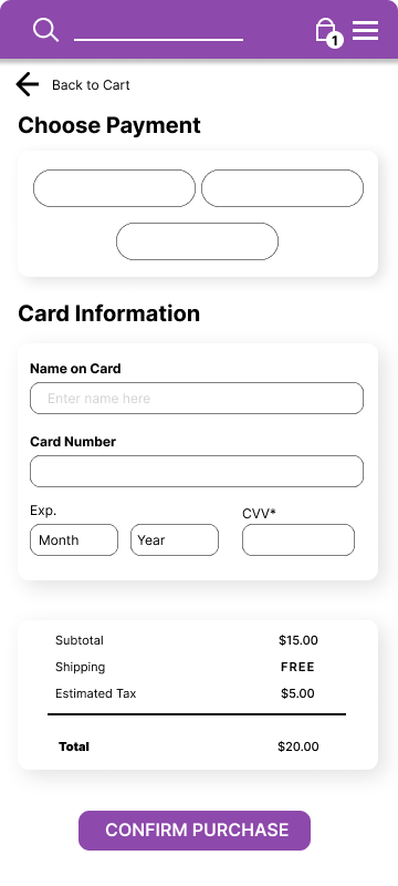
By featuring the customer's name and face, it provides immediate visual confirmation that they are accessing their own account. This can be particularly useful in multi-user environments or for users with multiple accounts. Additionally, displaying payment due dates helps users stay on top of their financial obligations and avoid late payments. This design choice allows users to quickly assess their current financial status and manage their payments efficiently.
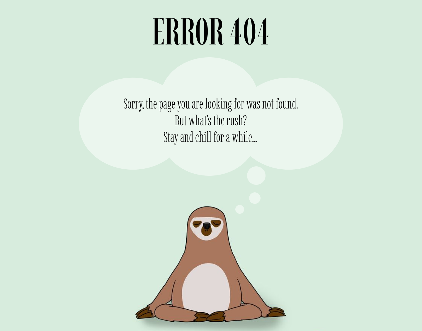
A well-crafted error 404 page with a unique and memorable design can leave a lasting impression on users. When encountering errors in the future, they may recall the enjoyable experience they had with the error page and view it as a reflection of your overall attention to detail and user-centric approach.
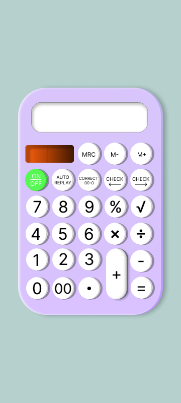

By designing a calculator with a distinctive aesthetic, you differentiate it from the standard cellphone calculator and other calculators available in the market. This can help attract users who are seeking a more visually appealing or unique calculator experience.
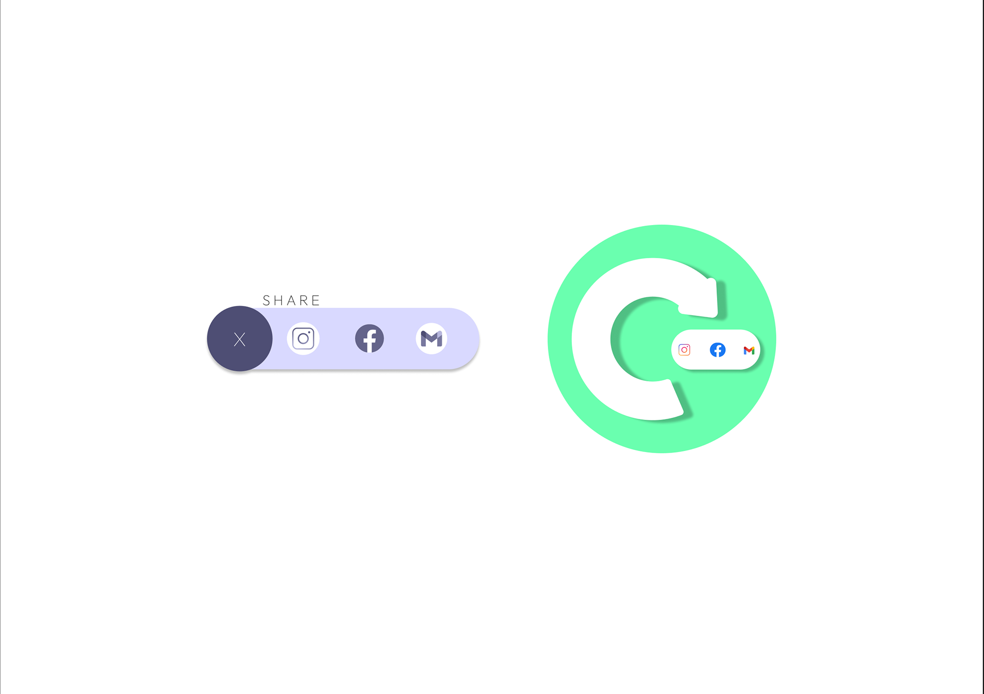
A half circle can create an interesting and visually appealing design element. It adds a unique shape to the layout, breaking away from the traditional rectangular or square design patterns. The curvature can contribute to a softer and more organic look, which may enhance the overall visual appeal of the share buttons.
Personal Website Concept